explore Dundee
The signage in DJCAD is usually kept very simple. The font is often slim and italic. It is not something that actually attracts attention and it could be easily passed without notice. There are a lot of safety signs that explain in imagery way the right action in case of danger. Regard this type, there is another main kind – signs that give direction. However, even if they are a lot of them, there is still lack of good orientation in the building.
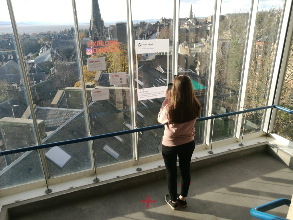
Despite the level five corridor, the café and the library, there was one place in the building that had caught my attention – the west stairs and especially the area between level six and seven. The view that the window reveals is stunning. I have noticed that many people as well as me stop to admire at it but without any other further actions. Not even a nice photo. Not even question themselves what they are actually looking at, what are these buildings. This string of thoughts had led me to the initial idea of our group.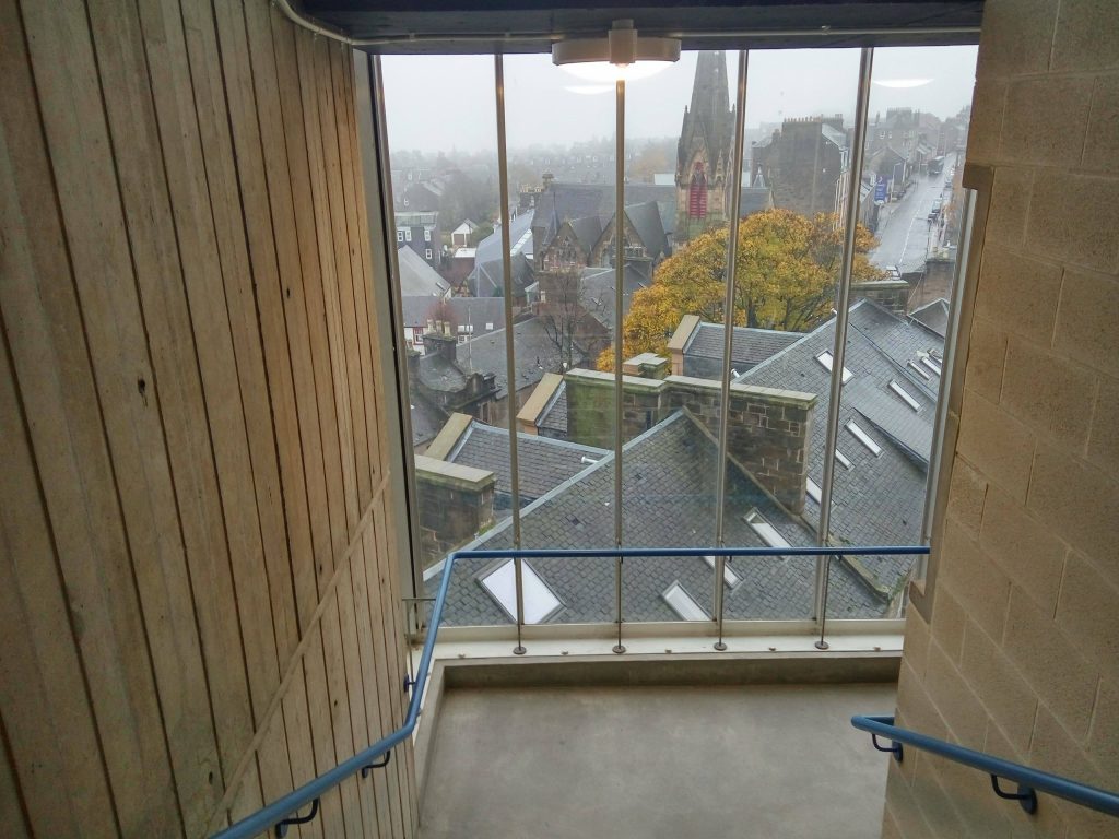
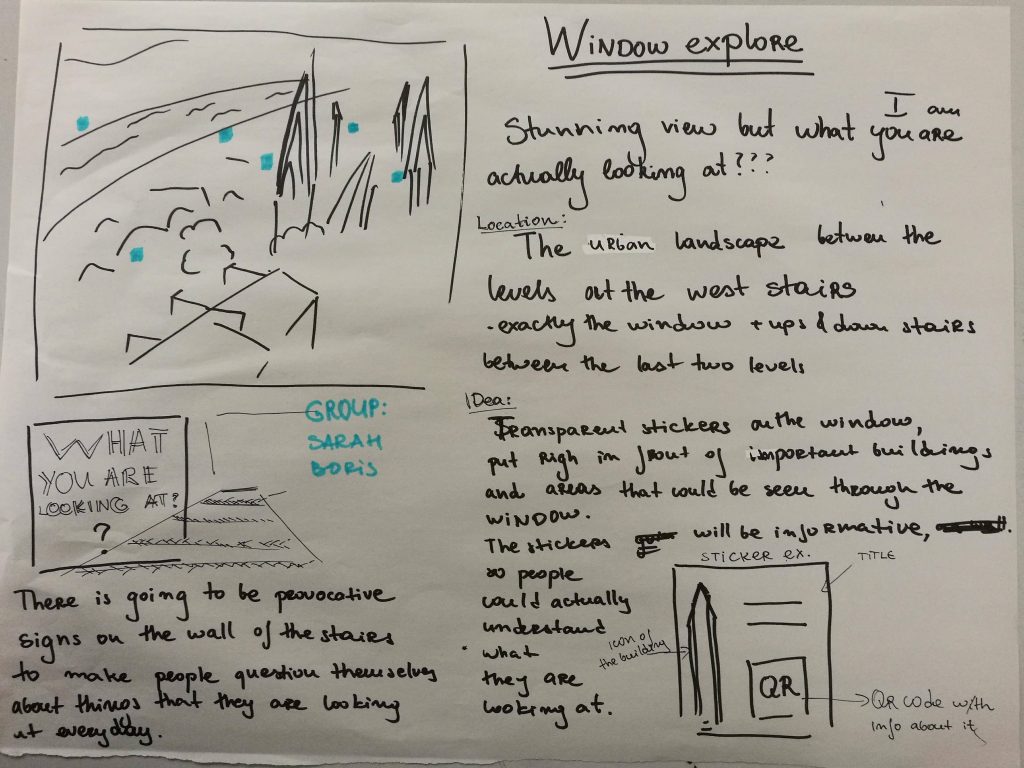
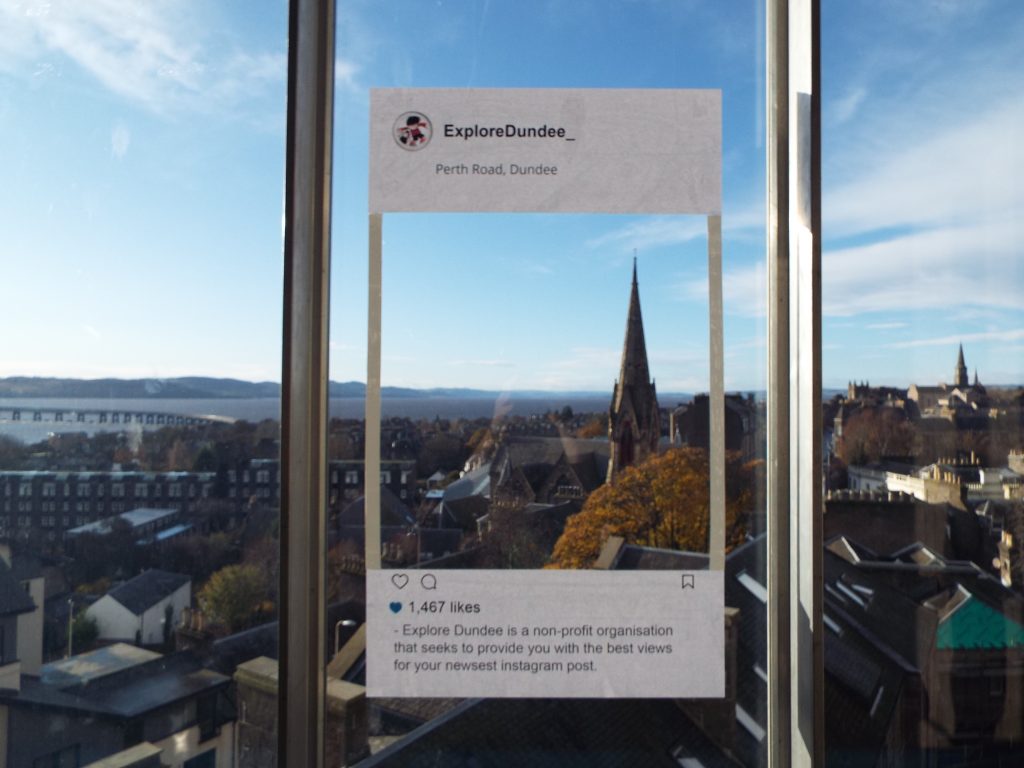
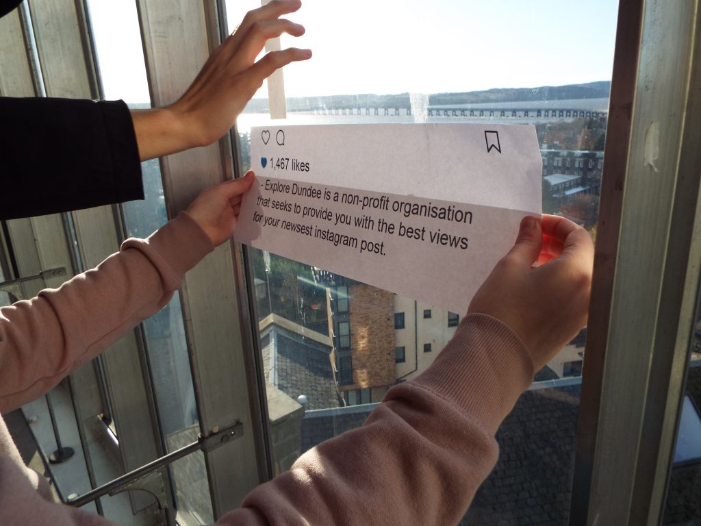
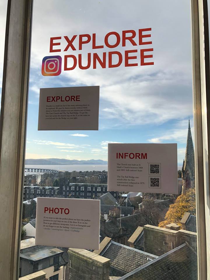
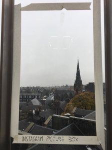 However, influenced by a wise advice, we decided to make the idea even more interactive. The new project included an Instagram photo frame, that leads to a perfect view and picture spot. To be navigate the potential photographers we marked on the floor 3 different points to stay and observe the 3 main things that can be viewed – the Tay Rail Bridge, The Gate Church and Perth Road. However, we kept the initial idea of the project being informative so we added a side info box (that later on evolves in three). We decided that the bridge and the stunning cathedral were our focus points. So this box is actually the developed idea of transparent stickers, while includes a catchy fact about the building + QR code. The other two boxes included information and explanation about the whole idea + some Instagram hashtags to be used. And to make everything more real we fake a non-profit organisation that aims to motivate people explore by all kind of means. As an additional thing we added marked spots on the two stairs so that are the perfect spots to stay for a minute and admire the Bridge or the cathedral. As a team we worked really well, respected each others opinion and stayed open-minded for new ideas.