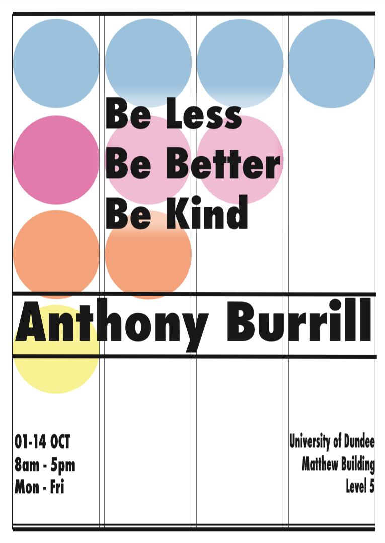
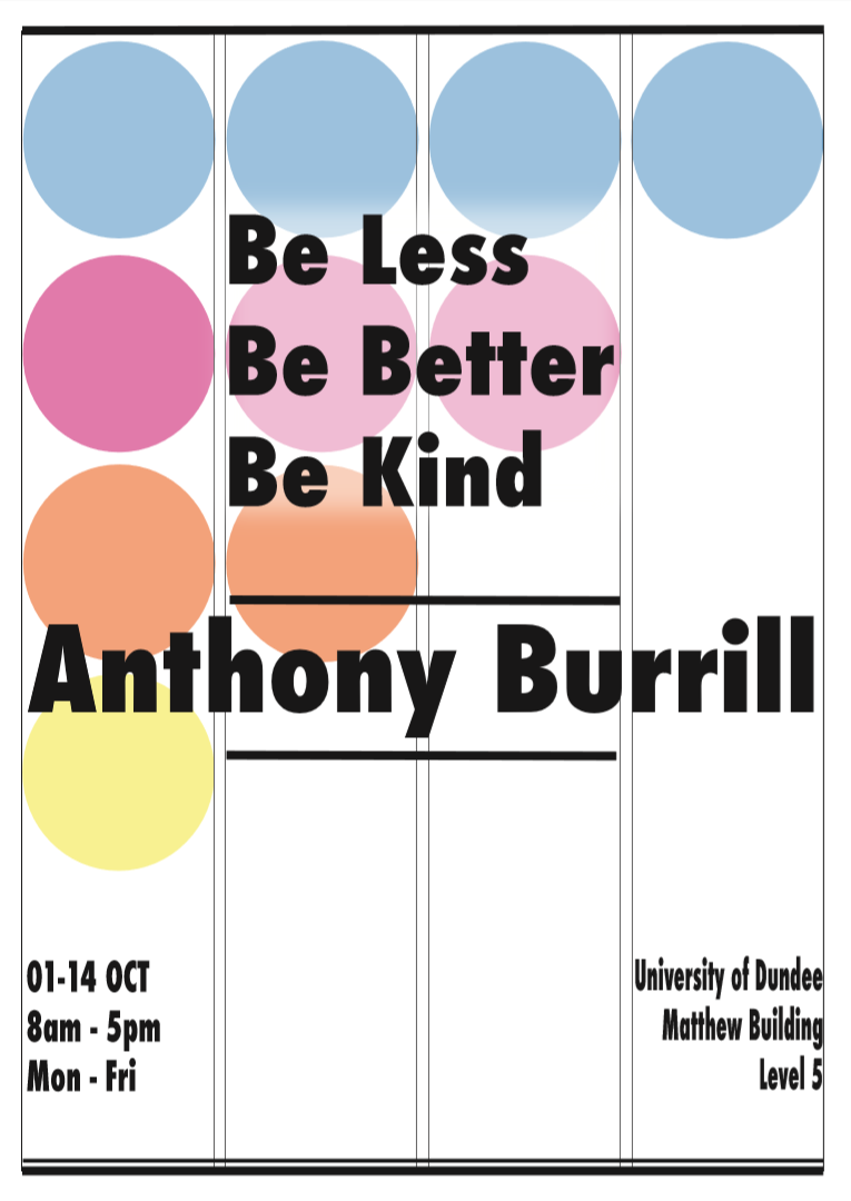
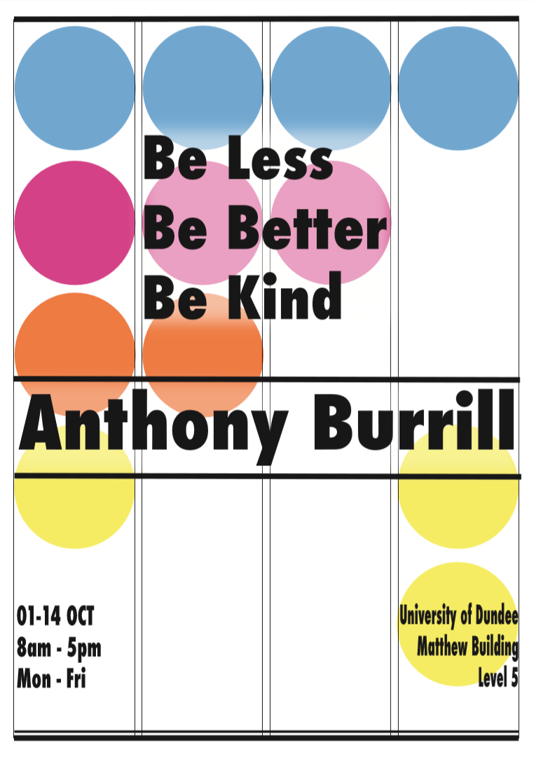
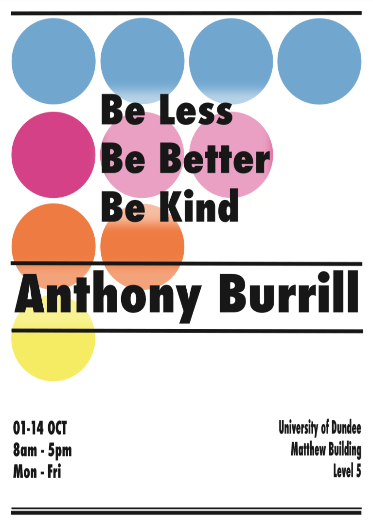
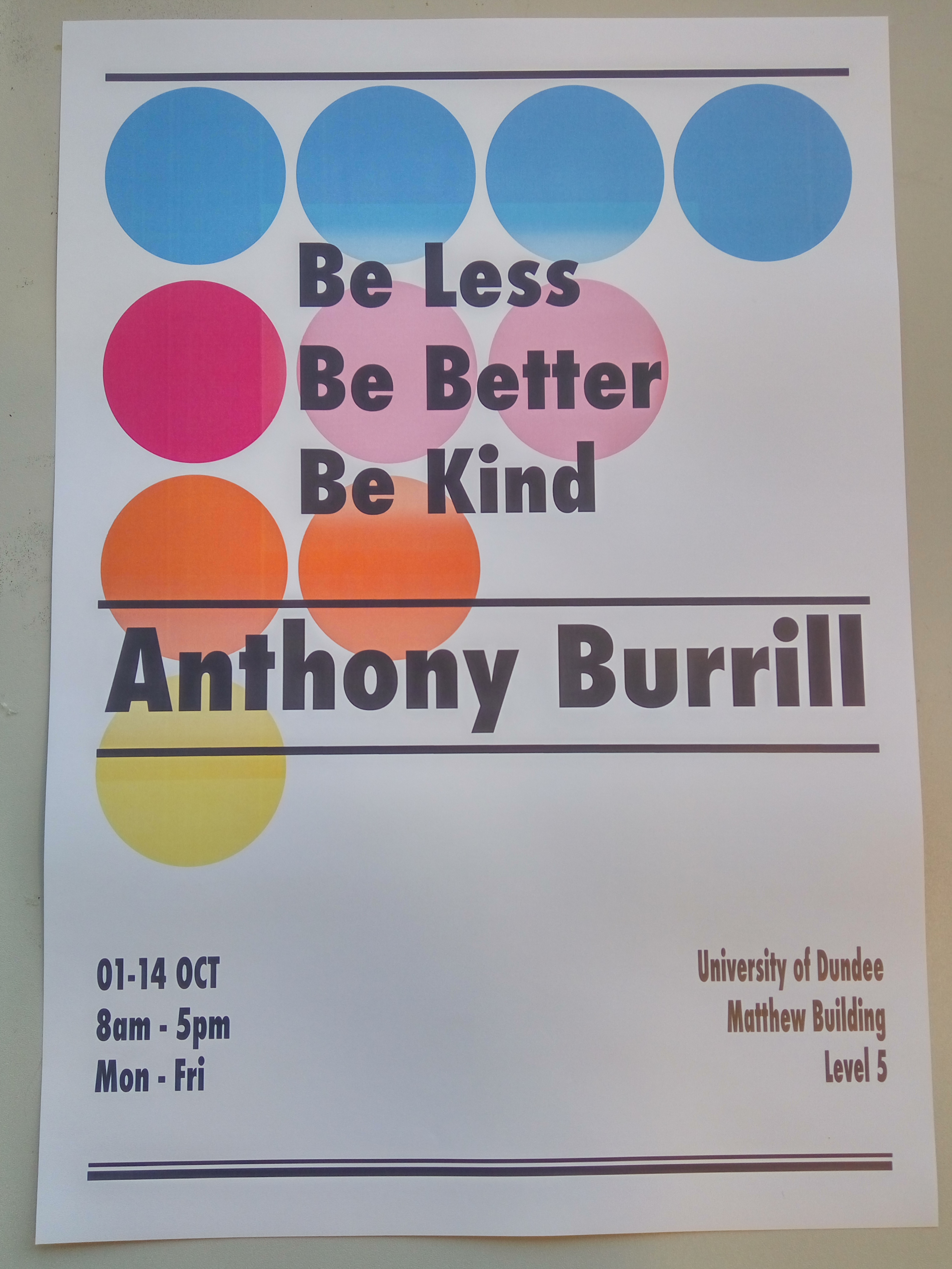
The poster brings up all of my little ideas for this brief in one piece of paper.
After choosing the designer and the venue it was time to create the poster for the exhibition. I knew that I want to incorporate Burrill`s style in it,
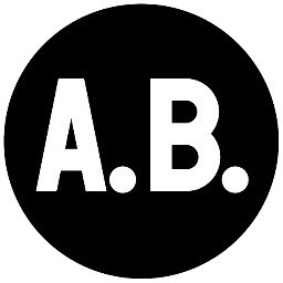
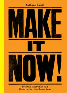
so I selected some of the main features in his work: the colours in his work, the circle main shape of his logo and the line dividers he is using in his text designs.
The layout
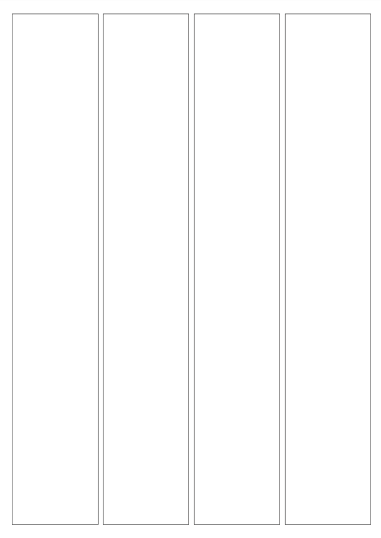
includes a portrait orientation with four columns and three horizontal parts.
The first part is the title which is centered between the two middle columns. I chose it to be “Be Less/ Be Better/ Be Kind” as a sum up of Burrill`s ideology, which is the reason to opt for him in first place. The title itself is justified in left. The font is Garamond in Bold and black as I found it to stand out the most in that way. Even more – all words in it starts with a capital letter and the whole box lays on a sheer white area (rectangle) so it could soften the colours underneath and pop up the text.
The second horizontal part is the designer`s name. I decided to put it on the center, because Burrill`s art is well-know and most of us have seen it but did not know who stand behind it. However, his name is a bit off the center because I did not want this to be the main focus of the exhibition. It is lied out over the four colums and it is separated with the rest of the parts with this divider lines which Burrill uses in his work. For this middle part, the font remains the same as for the whole poster.
The last horizontal part includes the venue and open hours for the exhibition. These two information boxes are put in the two out columns. They are justified responsively on which side they are – the left or right. The font is again Futura in bold. I Decided to place the date time on the left, so the eye is automatically drag on the left. I believe the date is more important for the user than the place.
All three parts are visually separated with the divider lines straight copied from Burrill`s work. Starts with one thick line, continues with the same lines for the middle and ends with double line with thin and thick parts.
The background
itself is very simple. (Which is my style!) I kept it white and create a cascade shape with circles. I used circles because it is the shape of Burrill`s logo. And for the colours I also used his work as a inspiration. I left the cascade shape like it is so it could lead to the date information.
I tried to put main features of his style but also stay true to my personal one.
And here it is all of my progress: 