A brand new thing
I enjoy doing research about different magazines and exploring new designers, but creating a real article for a real magazine was way out of my comfort zone and knowledge. I had not only to come up with an idea and to develop it, but also to learn working with new programs. I may not be the most skilled or have the best ideas, but I am hard-working and surely never give up!
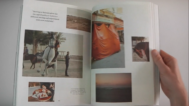
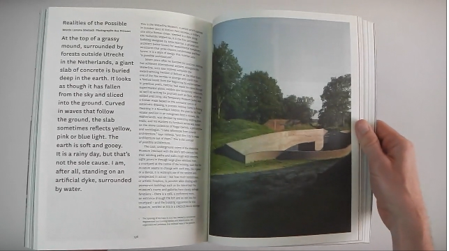
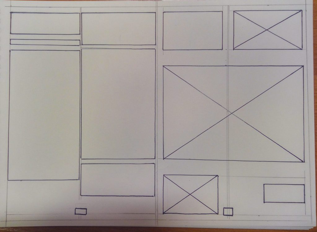
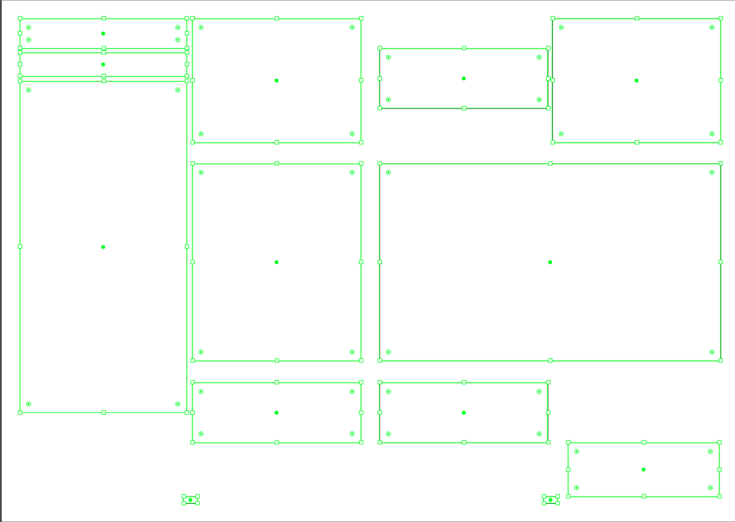
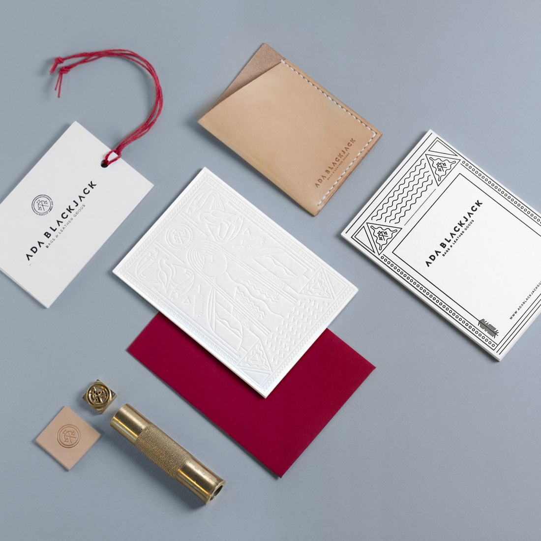
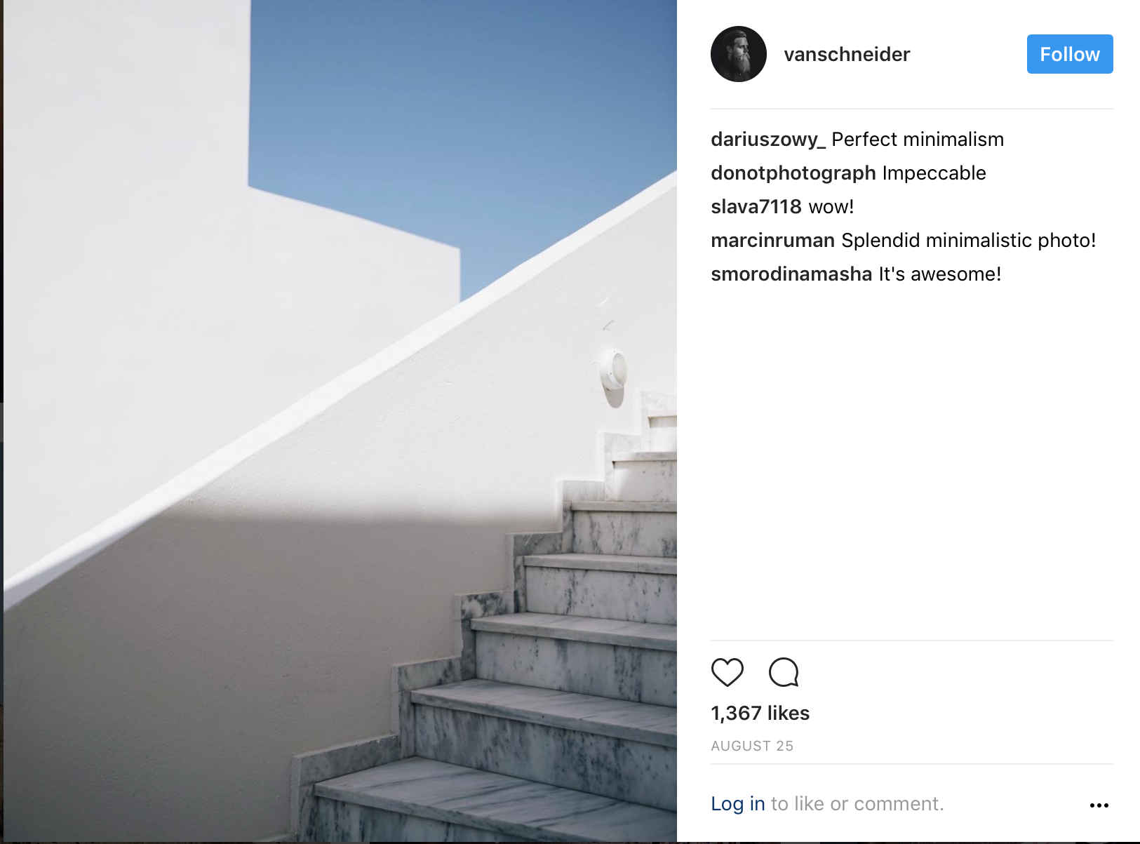
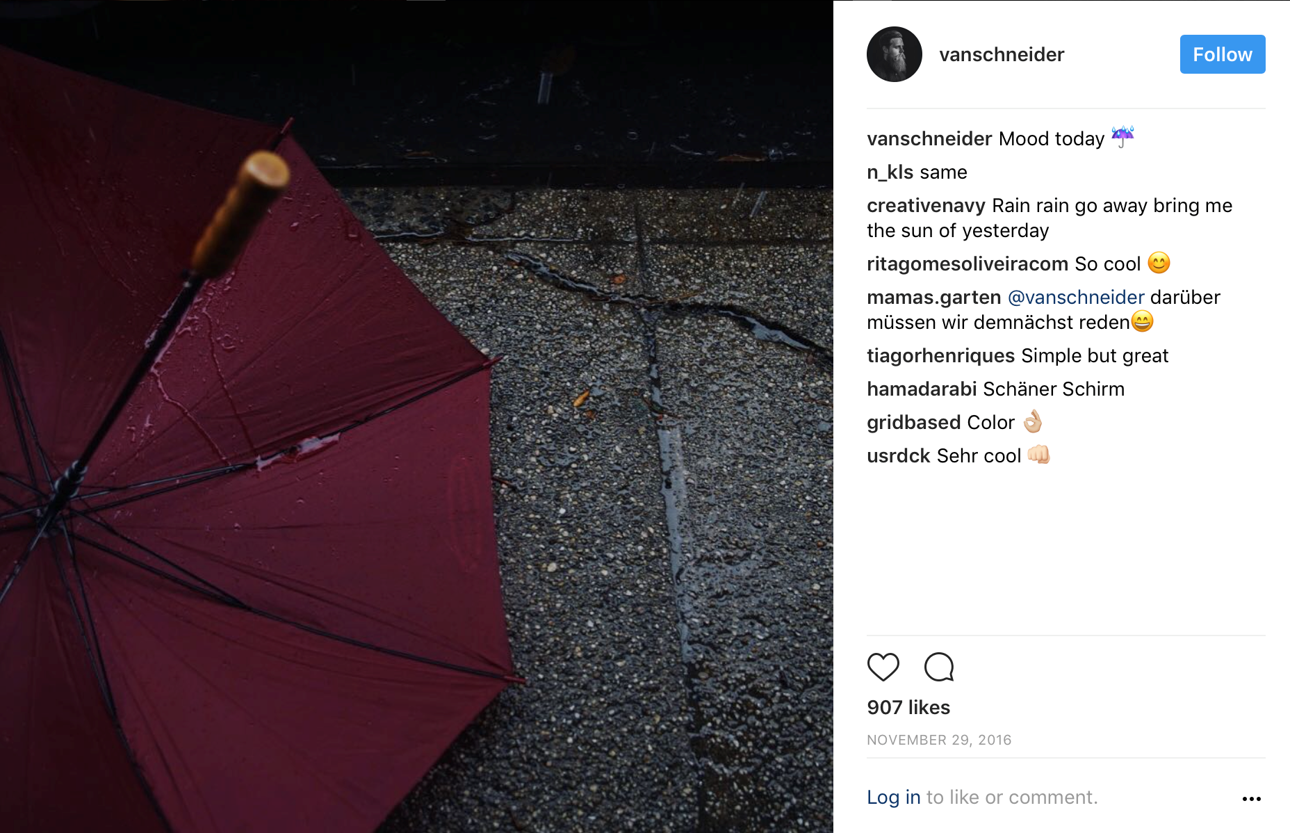
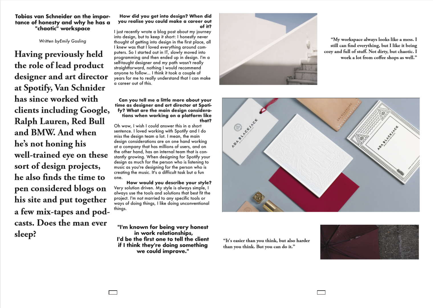
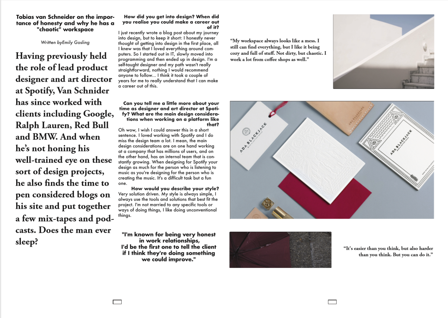
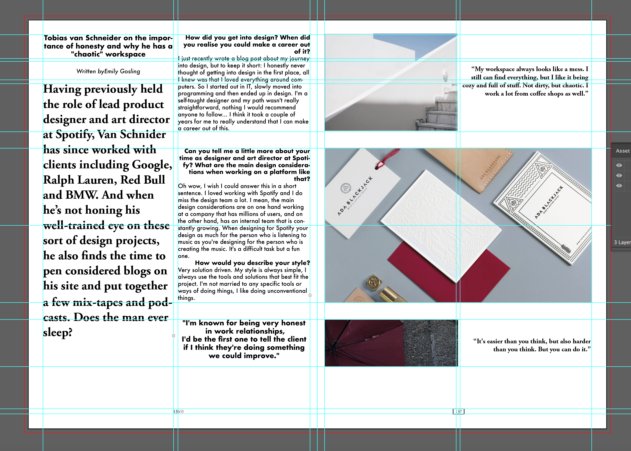
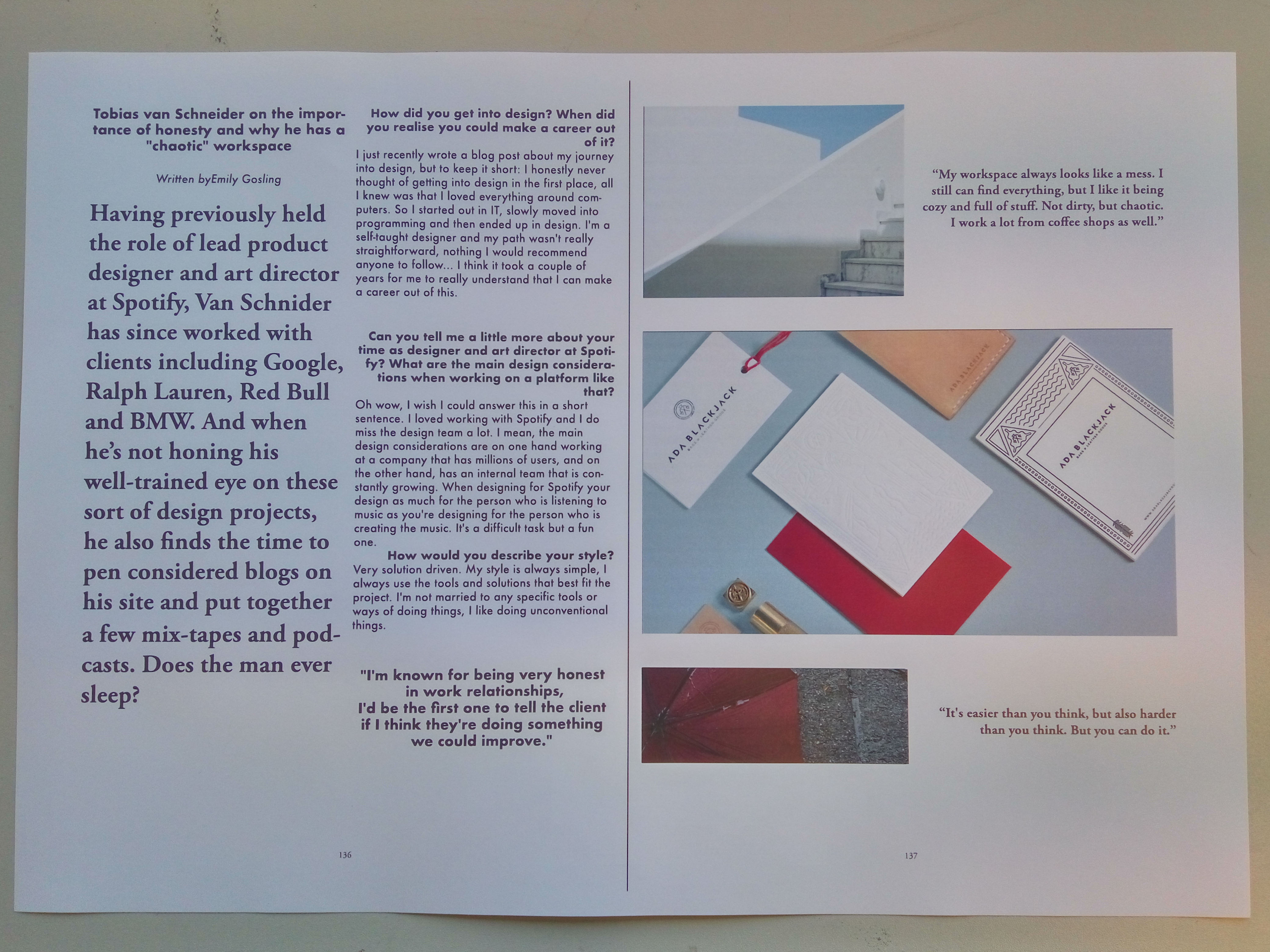
I started by taking inspiration out of the magazine. I chose two different pages – one for the pictures and one for the text. I sketch my first draft and I should say that I did not change it drastically. Then I proceed to editing the article and shorten it to 500 words, keeping only the most interesting parts. And lastly, I browse trough the entire portfolio of Tobias Van Schneider and his personal Instagram (over 1000 photos). I wanted to create a nice colourscheme with mainly muted tones and one accent colour.
I used two columns spread with as much symmetry in it as possible. For the text I used mainly Futura because I like the boldness in it and Garamond as an addition since it is semi-serif and is keeping with the simple style. The left part of the text I kept as an introduction, making it really bold and stand out, just like in original magazine. On the right side I placed the interview itself, justifying the questions on the right and making them bolder, and keeping the answers on the left and regular. I used quite large font size and average of 46 characters in line. I put some of my favorite quotes from the interview between the pictures to break-up the style.
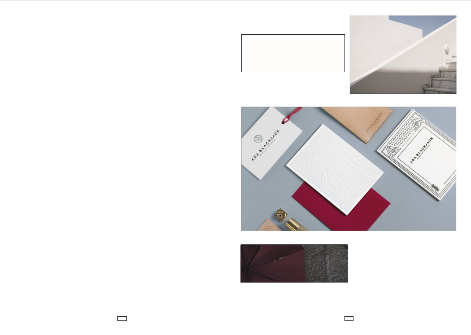
Let`s see the process: