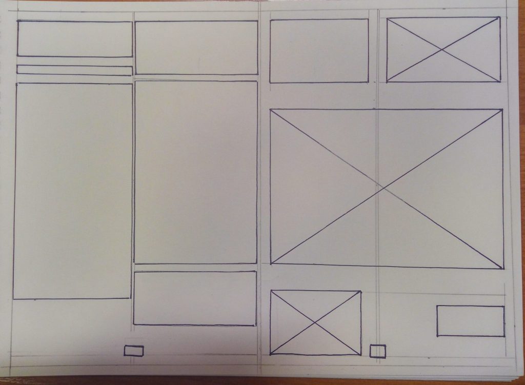
For the second week brief we had to design a double page spread for a magazine, containing a 500 words article about a designer and art works, graphic, photos.

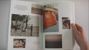
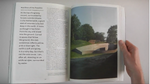
Having to choose between 6 significant designers, I opt for Tobias Van Schneider. An amazing artist, with various work types, but all aesthetically pleasing, pushing to act of exploration. Although he has much to show, with his powerful mind-set he has also much to say. This is the reason I chose Disegno – a magazine that is “for reading” (quote Johanna Ross, founder and publication director). After looking closely to the pages’ layouts I noticed that there are not a certain type of templates they are using. Everything is very various and artisticly, but still very attractive, which was the second main reason to choose this magazine.

