Continuing with the basic principles about graphic design, the second day lecture was all about typography. You may not believe but the science behind the fonts we are using everyday(the one that you are reading right now without even realizing) is really fascinating. Despite other student that were kind of bored from this typography lecture, I really enjoyed it myself! I don’t know but I have always been interested in letters, fonts, how they look like, what is appropriate to be used for. I remember me being 8 years old, sitting on the computer, looking at open Word document and browsing through the all fonts installed on. I was making them bold and italic and justify them differently, then creating shapes with the text… It was a real joy! And I am happy I was introduced to this word as a grown up person. Now, I have one more area to look around.
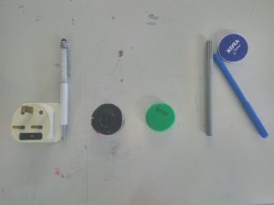
 As the previous day, again we had little tasks that could help us understand better the subject. The first one was to think about a word with four letters and then write it down on the desk using objects from the room. After we were all done we walked around and looked at others creations. There were some really good and clever ones.
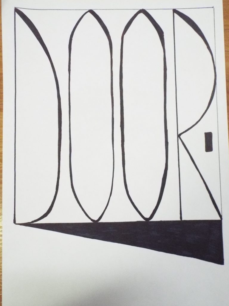
Then we had to write by hand a four-lettered word, but professionally: measuring out everything and putting in the principles we have learned. I made the word “door” using tall, slim, sans-serif font. And because it had to be more interesting I put it in a open door outline (how creative, huh?! 😀 )
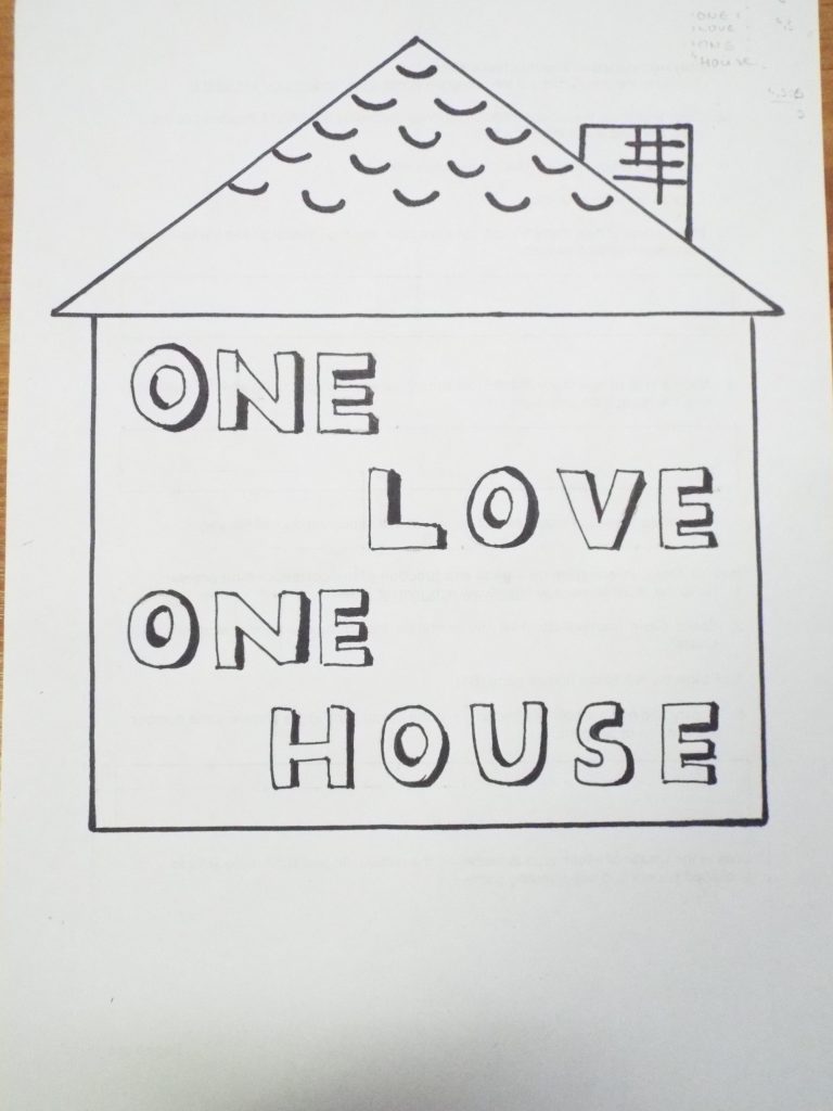
The last task for the day was a step further from the previous one. Again we had to write down but that time a quote from song or movie and incorporate it with some shape. I chose to use sans-serif, fat font with a drop shadow and put it in a house since the quote. I actually enjoyed this tasks so much that I redo them at home!