Beginning the new module Picture, symbol, icon, dedicated to graphic design, we had to learn about some important principles. We start with some easy rules like that we start reading from left, we focus on the biggest element first; our mind follow lines and this is a method to lead the eye and that we are drawn to the image first. After that we head on some more principles that we unconsciously follow, but not always understand. That is why we had to do seven challenges in order to get more aware of this design rules.
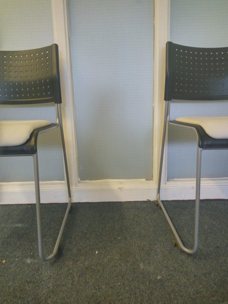
The first one was symmetry. A very beautiful, pleasing way of telling a story, or concentrating the focus on certain thing.
Then we have the rule of thirds. Extremely helpful in making photos, designing layouts and arranging spaces.
The next one was perspective. A favorite word of mine, became a mind-set for me: to look from a different angle, to see that there is always another way, to understand that there are other view-points and opinions. Very good exercise for improving looking skills.
Of course we talked about colours. Colours not only in a technical way but also how they could change everything. They can lead, can abstract, can be the best “weapon” and also can cost a lot.
Mentioning colours, we had to bring up the colour palette topic. It is amazing how different tones could change the feeling about an art piece, give it other personality.
We moved on that how brands use the colours. We did a little game, like an experiment, on how we connect certain colour combinations with brands. It was a good exercise for me, because I realised I don’t give that much of attention to important thing like this.
And last but not least we talk about light and shadow. Simple thing like that could change the perspective of anything and it is a really nice “mind game”.
It was day full of a lot of new experiences, learning importan
t principles, and understanding better old knowledge.


