After having some basic knowledge about important principles, typography and page layout it is time to dive in the real work.
The main task about this first brief was to create a poster for an exhibition of a designer. We had to came out with an idea for a title, venue and opening hours, but before all of that we had to choose a designer. After doing my research I decided to opt for Anthony Burrill. Why I chose exactly him is a topic for another blog, but my main reason is the ideology behind his art
I knew that I want to incorporate his style in the poster, so I selected some of the main features: the colours in his work, the circle main shape of his logo and the line dividers he is using in his text designs.
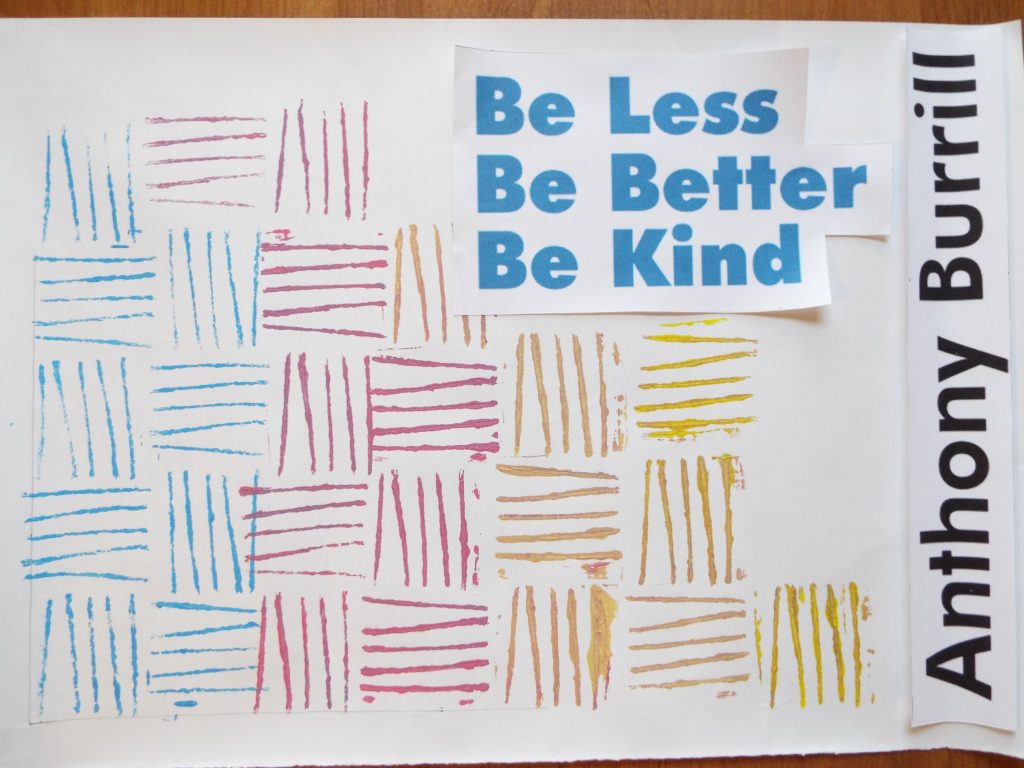 My first draft was just an idea that pop up in my mind. I put together the lines and colours in a descendant shape. The colours are nice, saturated, but don’t bother the eye and took away the attention. I also came up with a title at this point, which perfectly sums up the main ideas behind his designs.
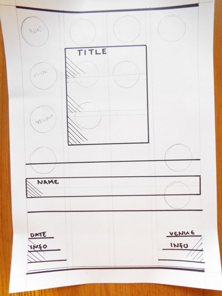 Not surprisingly, after having a nice clean layout, my mind was ready to think about the poster design itself. I kept the descendant shape and colours, but transformed the line pattern into circles. And because I really wanted to use the dividing lines he is using, I just copy the lines from one of his work. So there is one bold line at the top, a line between the title and the name, one between the name and venue/hours info and of course one on the bottom, which has an additional thin line with it. Laying out helped me clear the idea and I am continuing to develop it!