You are not lost, you are exploring!
The last brief from Ways of Making module was definitely the most challenging one. Our task was to work in pairs and design a new experience for user playfully navigate a place. We had to pick a case for our customer. I always start thinking from my personal experience when coming up with idea, so it was sure that I would like to design for a new arrival (just like me). Fortunately, my partner also had just arrived in the town, so that wasn’t even a topic. If I should say something about the team work – I was lucky. We synchronized very well even thought we hadn’t knew each other before. I am doing interior design and he is product and that contribute to the process a lot. We were both very open-minded for other`s ideas and also one really important thing – we respect each other.
The idea
We came up with the idea very quickly actually. This was a really good kick start, because that`s the most difficult part, I believe. In the second the brief 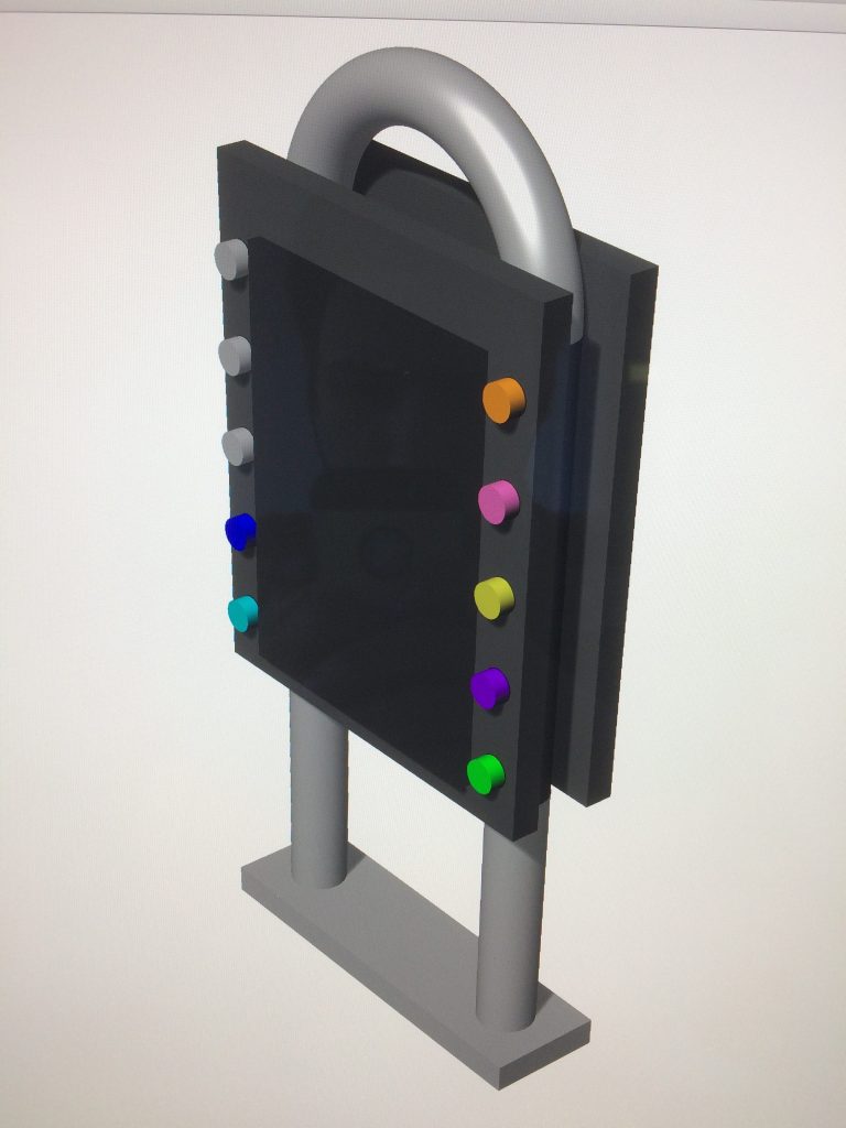 was presented to us, I recalled a not so pleasant memory from my first day in Dundee. Because I had missed the whole introduction day so I had to find the school office in Mathew building by my own. And this seemed like a really difficult task, consider the fact I entered from the back door. Surprisingly, even people from the staff didn’t know the building and everything so well and they couldn’t help me. That is why I really wanted to make something to help students and even people working in buildings with a strange layout like DJCAD`s one.
Actual product
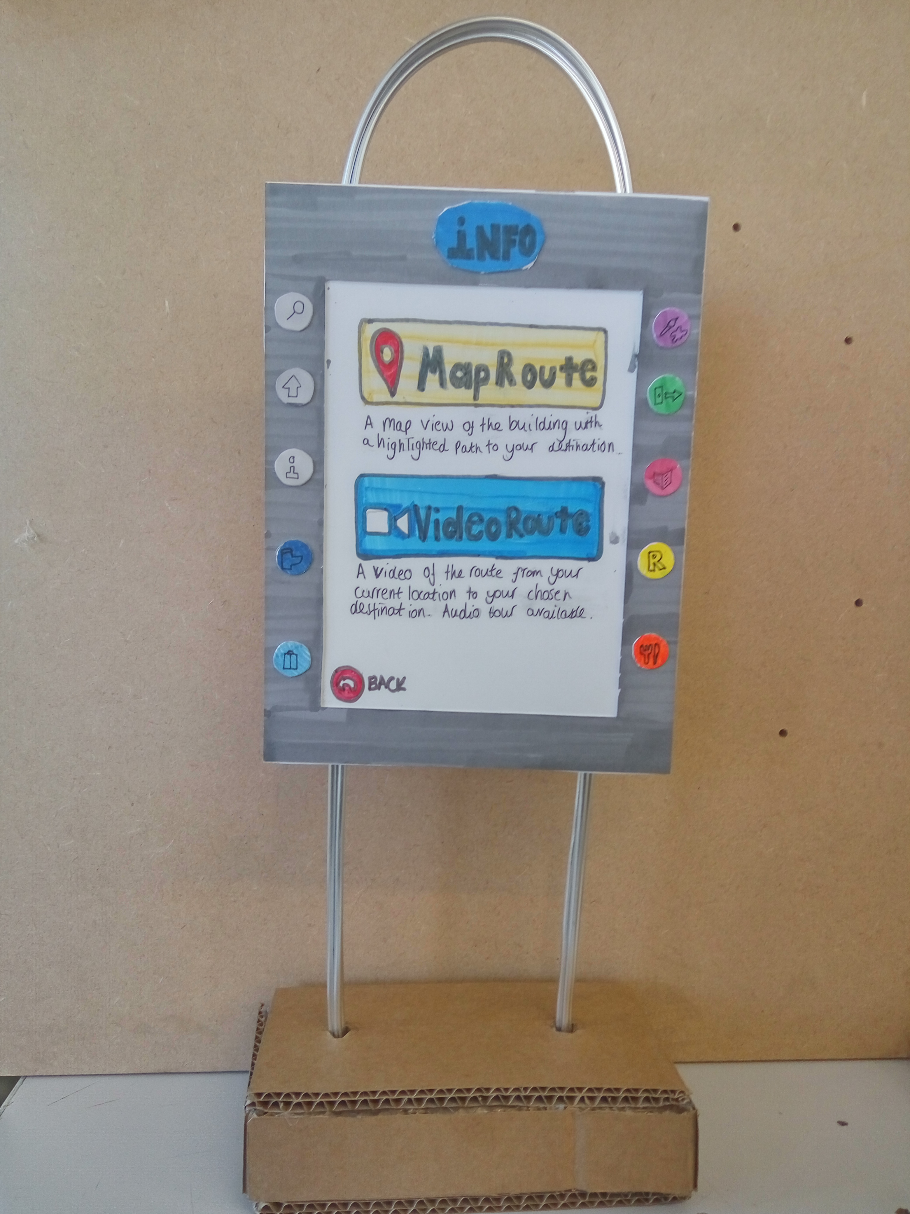
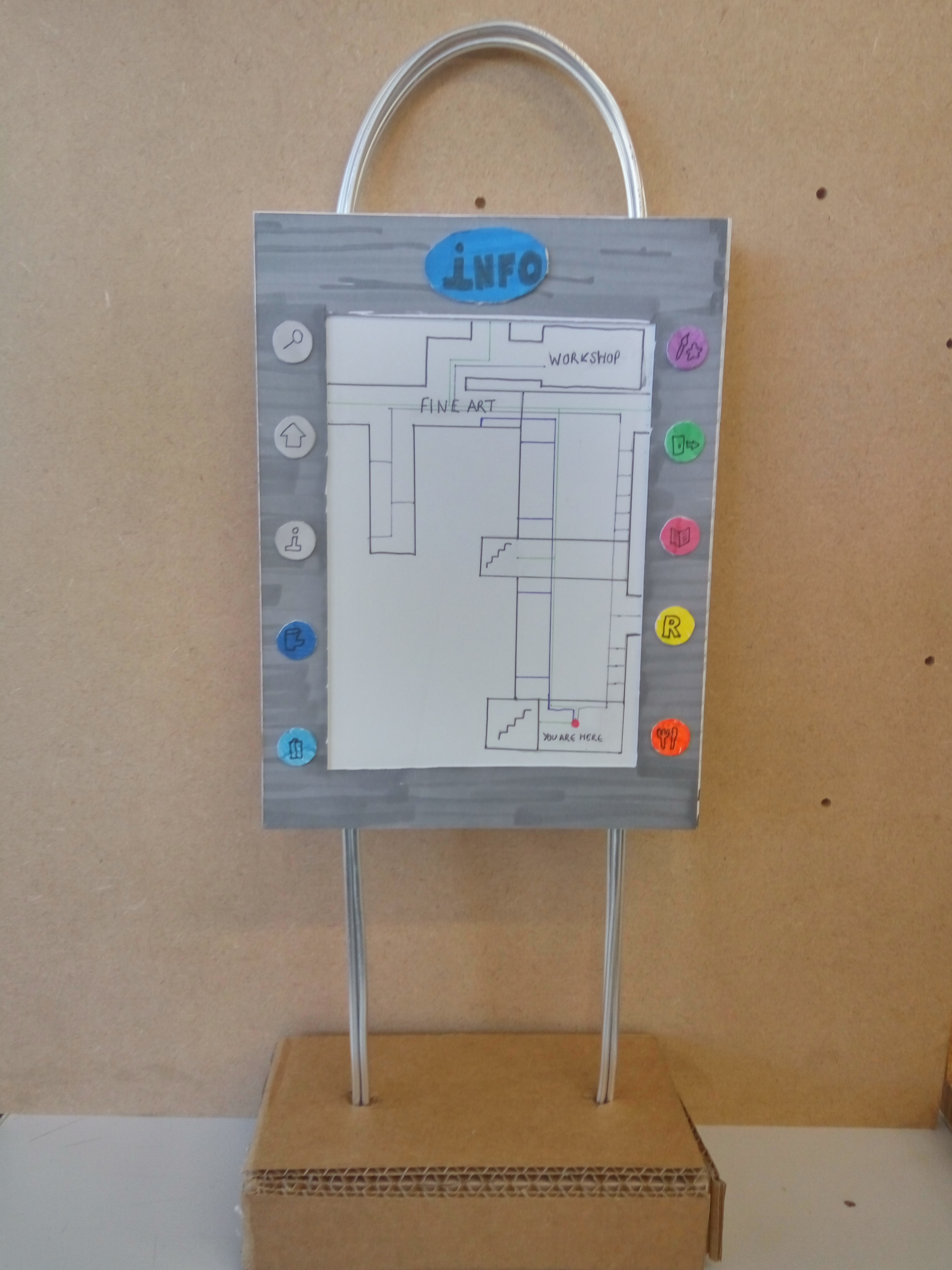
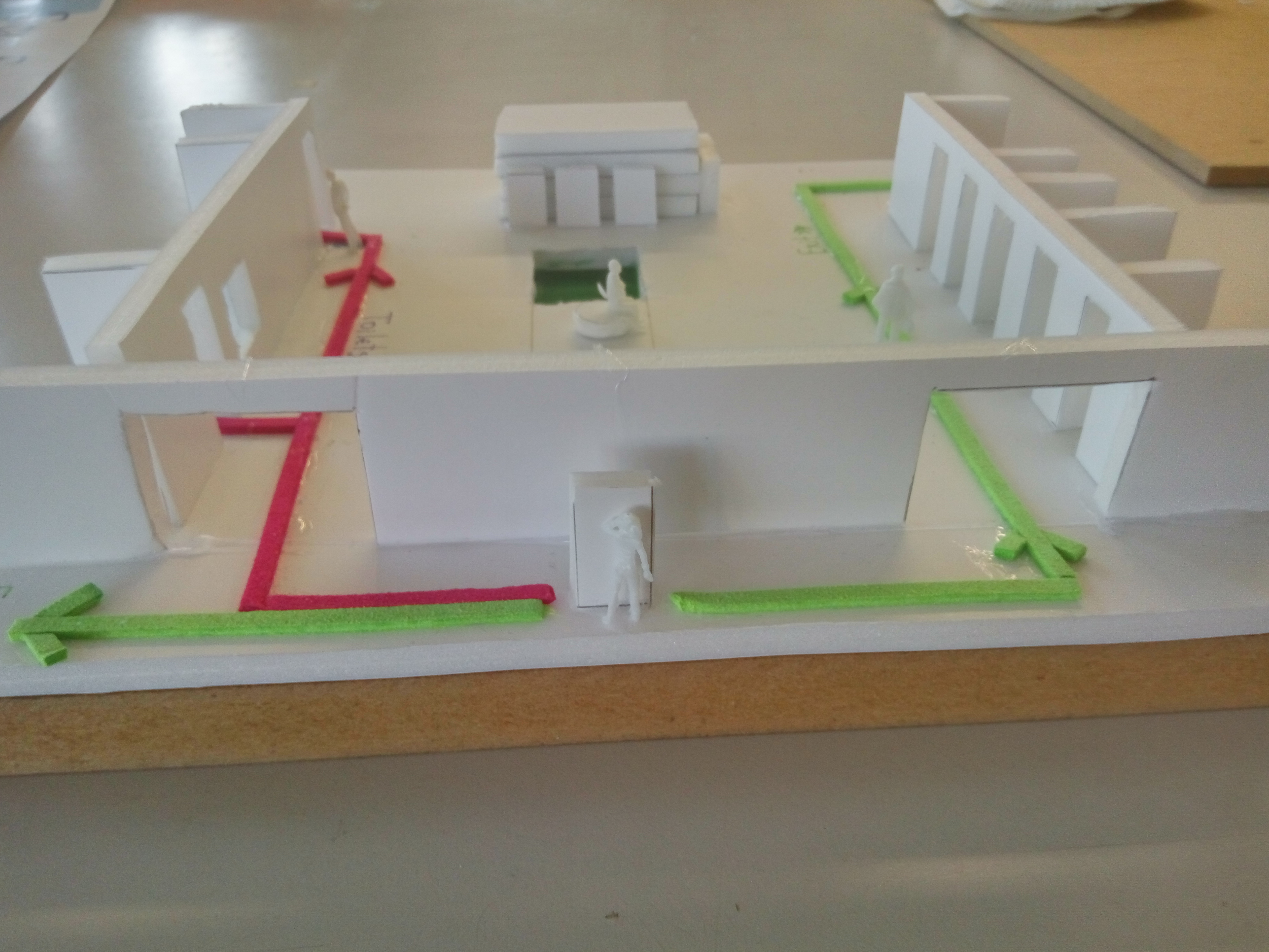
We design an indoor navigator. It is a digital board, located at every main point in the building such as reception, entrances, 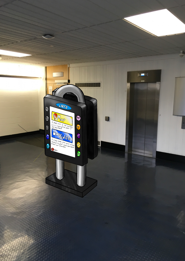 main flow halls and on every floor in front of the elevators area. The design is very simple, approachable without stressing out the customer with highly digital appearance. The console features ten buttons that all corresponds to a preset location. The colours are chosen specifically for the location e.g. green for exit, orange for cafeteria, and also there is no red light, because we associated red with a danger. Once the user presses the appropriate button a coloured path will light up on screen showing you where to go. Simultaneously, a path of the same colour will appear on the ground in real life, directly leading you to your destination. And additionally, to make it as easy to use as possible we added and “info” button that helps the user. Regardless the main location and buttons, the board have a search button. It leads you to a page with search field, touchpad keyboard and suggestion categories such as “Lecture Theaters 5013-5018” or “Workshop”. After choosing the location there are two options “Map Route” and “Video Route”. This makes it highly accessible as it features a video and audio tour guide if the conventional map view is not for the user. The videos are short but very descriptive, supported with audio. We made a video example to present the idea better:
The experience
The whole idea was to make a mapping system that navigates but also contributes to a nice experience of exploring. The product we designed, shows the way without “erasing” the feelings of the user and put him into 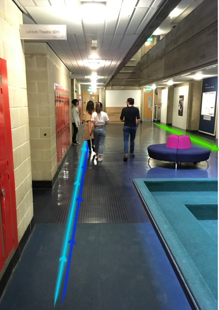 stressful situation. Each of them make the user feel aware of the place, make him acknowledge the path, which reduces the anxiety feeling of being lost. Even the coloured strips guide lines on the floor are a very delicate way to lead the user. The customer is able to explore and look around, but still without loosing the track. He is not looking down to a smartphone or device, he is actually calmingly examine the new area. The feeling of being lost in a new place is becoming pleasant.
Concept Board
The last task to do was a concept board. Neither of us had made a concept board before so that is why we kept it very simple. We put a 3D module of the navigator as well as a photo to represent the light strips. We also created a very simple logo that brings together I and N (indoor navigator) and also some arrows and the idea of path. The colours are very simple we only had one accent colour inspired by the light strips.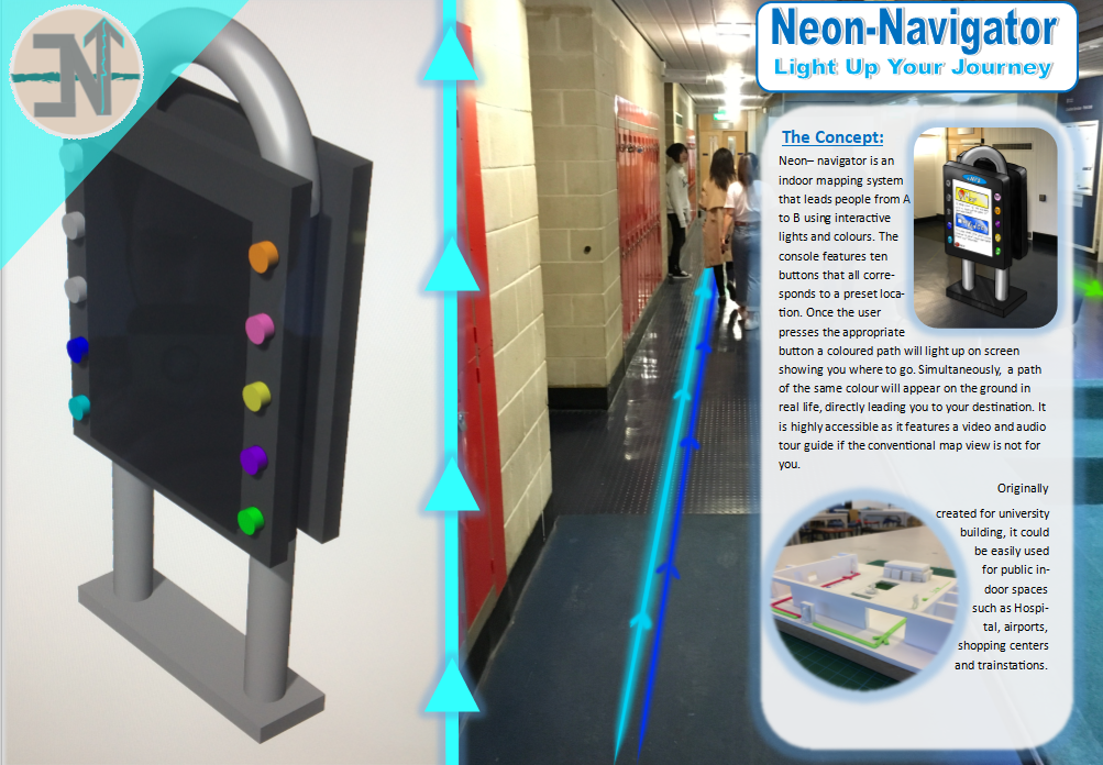
By doing this project I`ve learned that
the most important part is to know the needs of the customer and also to visualize the real experience.
And of course I would like to improve my skill in doing concept boards because they are a really good way to present an idea.